Support the Common Feed Icon
A recent Yahoo study reported that four percent of Internet users have jumped on the RSS bandwagon and begun subscribing to syndicated feeds. Considering the number of ways that web publishers show their readers they offer feeds, it's amazing we've gotten that many:
In an effort to make the concept of syndication easier for mainstream users, the next versions of the Internet Explorer and Opera browsers will identify RSS and Atom feeds with the same icon used in Mozilla Firefox. Since the market share of these browsers tops 95 percent, the icon will become the de facto standard for syndication overnight when the next version of Microsoft Windows comes out later this year.
The common feed icon has been adopted by hundreds of web sites in the last 60 days. I've been experimenting with it on Workbench and like the results.
In October, Jane Kim of Microsoft's Internet Explorer team explained what they were looking for when selecting a feed icon for the browser:
- It conveys the important attributes of feeds: newness, activity, subscription, and continual information.
- It builds on the most consistent and identifiable element used to represent feeds today: the orange rectangle.
- It avoids the use of text. Icons that have text do not generally work well for a global audience. For example, an icon with the text "FEED" may be cryptic to users whose primary language is non-Latin based. Text is very important to support an icon (in tool-tips or accompanying text). In English, we will be using the verb "subscribe" fairly widely whenever text is appropriate.
Microsoft ultimately chose Stephan Horlander's Firefox icon -- with permission -- and will use it in all of its software.
The RSS Advisory Board should officially support the common feed icon, adopting the symbol on its own site and encouraging its use on web sites, browsers, and syndication software.
Additionally, the board should encourage web publishers to use the icon on any feed, regardless of whether it employs Atom or the two formats that call themselves RSS: RDF Site Summary and Really Simple Syndication.
As technology reaches mass adoption, the technical details that matter so much to dorks like me fade into the background. This is already beginning to happen with syndication, in spite of several years of "tastes great/less filling" between advocates of different formats.
In Internet Explorer 7, two words are completely absent from all places where Microsoft tells users how to read their favorite web sites using syndication -- RSS and Atom:
The benefits of syndication are still a hard sell for non-technical people, seven years after Dan Libby of Netscape published the first format called RSS. The use of a common icon and jargon-free language like "subscribe to a feed" have the potential to make things considerably easier.
Update: I created the RSS icon collection graphic used in this weblog entry, which is available for reuse under the terms of the Creative Commons Attribution/Share Alike license.
Comments
When I adopted that icon for the Feed Validator I got -- quite rightly -- critizized because using the same icon in a way that behaves quite differently than all other uses introduces confusion.
Now I see that you have hidden an orange RSS icon in the top right of Workbench, and with semantics that means something entirely different than "Subscribe!".
Perhaps the RSS-Advisory Board could discuss proposals on what the correct semantics of the common feed icon should be.
Yes. This is definately a "Best Practices" discussion that gives guidelines for subscription deatails that are not in the Spec's.
Keep moving the world forward towards "mass adoption"... more feeds, less hassle.
The link at upper right is promoting the RSS Advisory Board site, which has a Google pagerank of 0 because we had to start a new domain with no benefit of redirects. I'm doing it on a couple of sites to call attention to the board.
It is quite understandable that the current chair of the RSS Advisory Board would want to promoting the RSS Advisory Board site, whether it be to Google or to all visitors. I never questioned that.
I'm questioning both the use of one common icons in an unexpected way, and the promotion of another soon to be common icon in ways that dillute the common meaning that IE and Mozilla seem to be giving it.
Point taken regarding my advisory board link, but I don't see how my use of the common feed icon on Workbench differs from how browsers are using it.
Internet Explorer displays the icon in several different places:
1. In the address bar when a page has a feed associated with it.
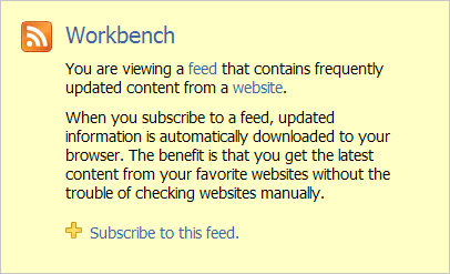
2. On the "You are viewing a feed" page.
3. On a "Feeds" button atop the Favorites pane.
4. In the Favorites pane next to each subscribed feed's title.
5. In the Internet Options dialog, Content tab, in the Feeds settings section.
The information that a consumer needs to know is what is the url of the feed. That same information pertains regardless of how they read the feed. I think that the common semantics of this icon should be to a hyperlink to the feed.
There are almost as many different methods of subscription as there are feed readers. I doubt that we can use this icon as a subscription button without contributing even more confusion. I think that all agents that subscribe to the feed from a page should use the autodiscovery links and and not rely upon a button. These should rapidly evolve into JavaScript tool bar gadgets like lots of us use for Bloglines.
I have been tracking this issue on this node.
As was Sam, I was criticized for using the new feed icons. I argued then--and now--that the web is an application. If the icon is supposed to represent the "subscribe" action (rather, the clicking on which means the outcome of subscribing to the feed), then I think I'm actually in the clear, since my site uses the Syndication Subscription Service combined with Phil Ringnalda's clever JavaScript code which, while allowing people to right click and copy the URL, sends those who click to instructions on how to use the feed.
I agree I can not wait till there is one standard button for RSS ATOM and XML feeds.
I posted a similar observation that in my travels around the blogs that interest me, I've seen a huge growth in the number of sites adopting the Mozilla Firefox feed icon. As your graphic illustrates well, for novice users it can be very confusing and frustrating what all these versions of links and buttons represent. I'm all for uniformity and consistency, so cheers to the IE7 team for getting the ball rolling, and as you point out Opera has since fallen in. I'd like to see that 4% grow to more like 20 in 2006. That may be a little optimistic, but you never know with trends. More at De Facto RSS Feed Icon Spreading Like Wildfire.
I found your post via Ray Ozzie's using of your graphic in his talk about making a mashup clipboard thingy.
I find this fascinating, and am glad you're covering it. You've got a great blog.
I referenced your post at [chrisbrogan.com] to see if folks would add to your conversation.
Finally!
We need a standard. This is a good one. I'm going to start using it and advocating it immediately.
I wish to use your RSS collection graphic for the cover of a brochure that teaches hospital staff how to use RSS.
How should I credit your work?
Very impressive.
Two years down the line and this has definitely taken off used everywhere I go. I've only gotten into RSS feeds in the last year, and so I just took it for granted that that was the image to represent it. I never knew that it had a whole lot of decisions to go before everyone decided on a logo. Don't ask me how I thought a logo did come about I mean, I didn't even consider it. Strange how that happens...
Nice icons. I will support them.
Add a Comment
All comments are moderated before publication. These HTML tags are permitted: <p>, <b>, <i>, <a>, and <blockquote>. This site is protected by reCAPTCHA (for which the Google Privacy Policy and Terms of Service apply).
![]()
Social Media
![]()
Subscriptions
Blogroll
Projects
Statistics

This blog has been published since Nov. 7, 1999 (a span of 8,936 days).
Thank you for visiting Workbench.
